Roblox VR: Quest
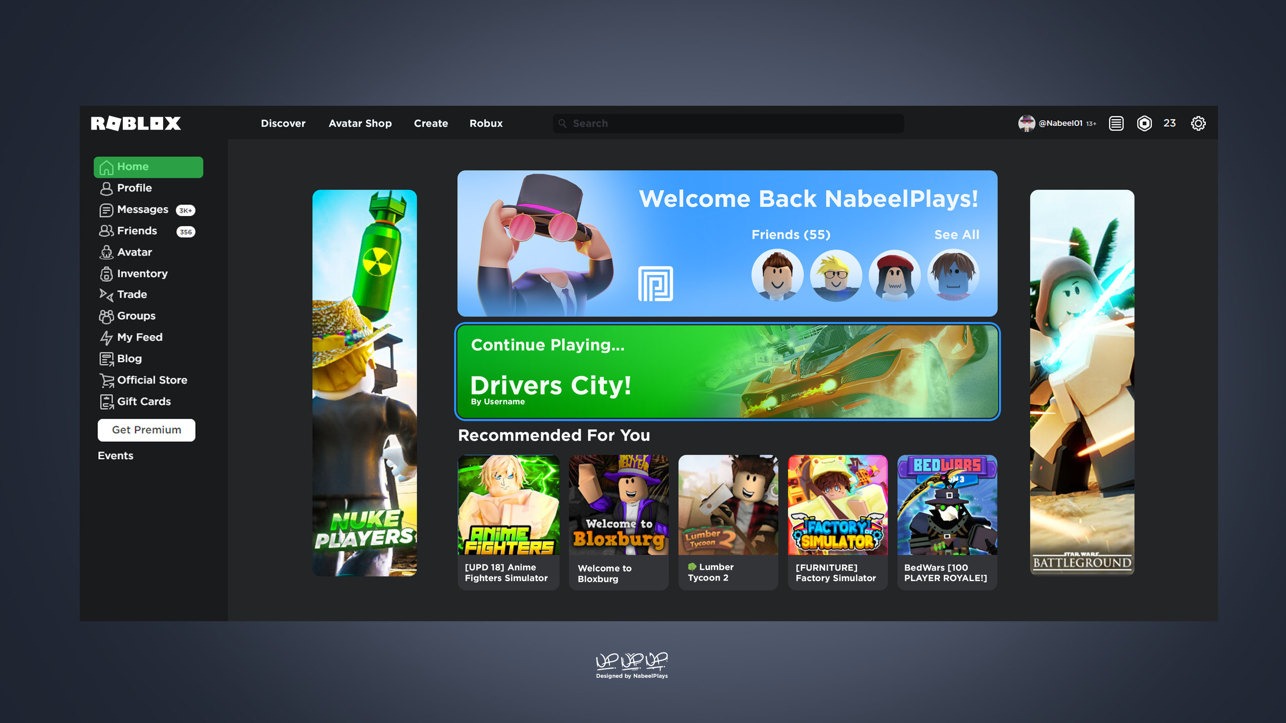
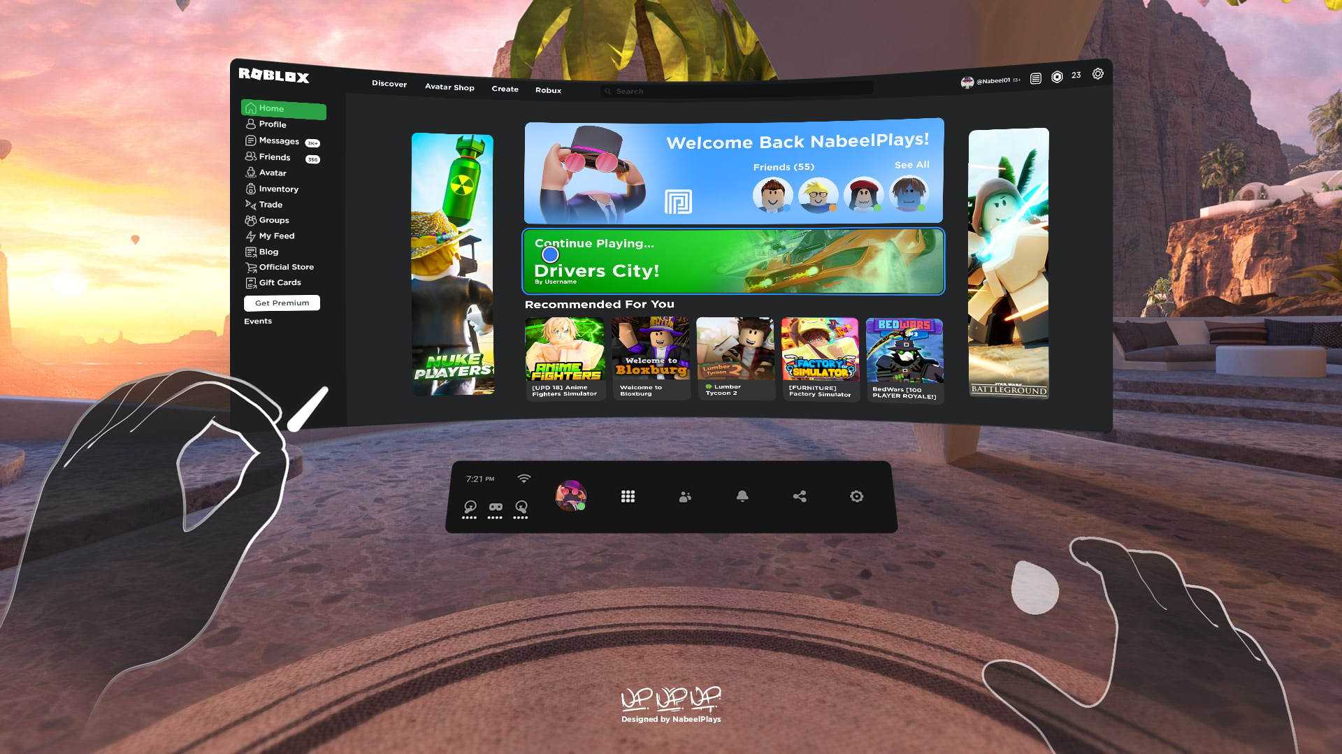
A redesign of the Roblox website to fit Quest VR’s interface.
Thought process
What I wanted to design was a mix between two platforms, Roblox and Quest. This is because of two factors, one being to stay true to the Roblox platform and its design whilst also keeping the intuitiveness of the Quest design.
What makes the platforms recognisable?
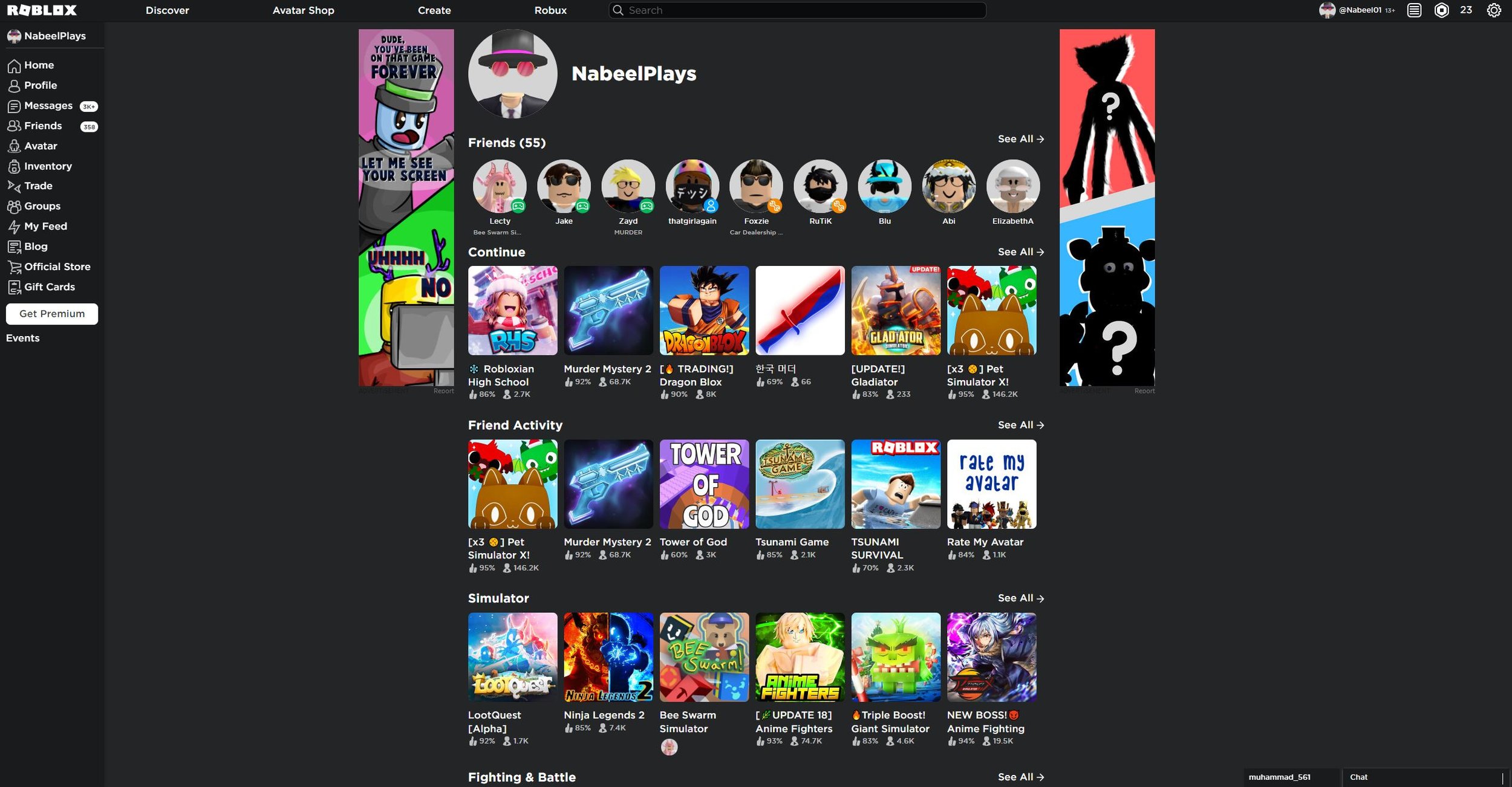
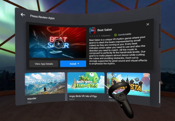
Well, the main thing we need to point out is what the similarities are. Both share a dark theme which is considerate for the consumer base since dark colours are more gentle to the eyes.
What are the difference? Well, Roblox has a list of unnecessary grids, “simulator, fighting and battle, adventure, action…” the list goes on. Quest on the other hand has one big grid for a specific game they think you may be interested in and recommended at the bottom which is easier for the user to interact with as it’s simple.
Colour Theme


